Hello everyone.
I realize I’m getting into this conversation well after it is relevant, but I was on vacation.
When #thedress went viral, it sparked a big conversation about how we see color. Our eyes have evolved over a few million years [citation needed] to be able to evaluate the color in the surrounding environment to be able to subtract other colors and figure out what is the actual color of an item.
Personally, I performed an experiment where I would open and close the blinds on a window, and watch the color “change”. It was fascinating to watch the perceived colors of an object change as the light source in my room changed.
So how does this relate to photography?
This is how ‘white balance’ works on digital cameras. The electronics will evaluate the scene and attempt to handle this adjustment for you. If you’ve ever set your white balance to ‘cloudy’ on a sunny day, only to realize your photos have a yellow color when you get home, this is white balance (setting your white balance to sunny on a cloudy day will result in blue photos).
Normally, your camera’s auto white balance is good. Not perfect, but good. It will almost always be a little blue or a little yellow, but will usually be close enough that most people will not notice.
The other side of white balance is the purple/green color cast. Outside of fairly unusual situations, this is something that most people will never notice. Cameras will frequently favor green, which our eyes are more sensitive to, and we will end up liking it more with the green cast.
Since I like unusual situations, here is an example of the auto white balance not handling purple/green properly.
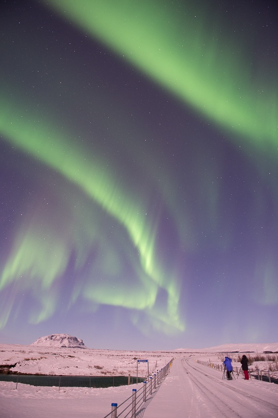
At first glace, this photo looks really cool. There’s 2 people out taking photos underneath an aurora.
After a few minutes of letting your eyes adjust, you may start to notice that everything is probably more purple than it should be (especially the snow, that should really be close to white). Why did this happen? This goes back to the electronics guessing what is white. Much like #thedress, the electronics of the camera and software of the computer are evaluating the scene and trying to guess what is the correct balance for blue/yellow and purple/green. Due to the green of the aurora (an unusual situation for most images), the camera assumes it needs to compensate by giving the image a purple tint. Normally, this would be the correct choice. In this situation, it is the incorrect choice.
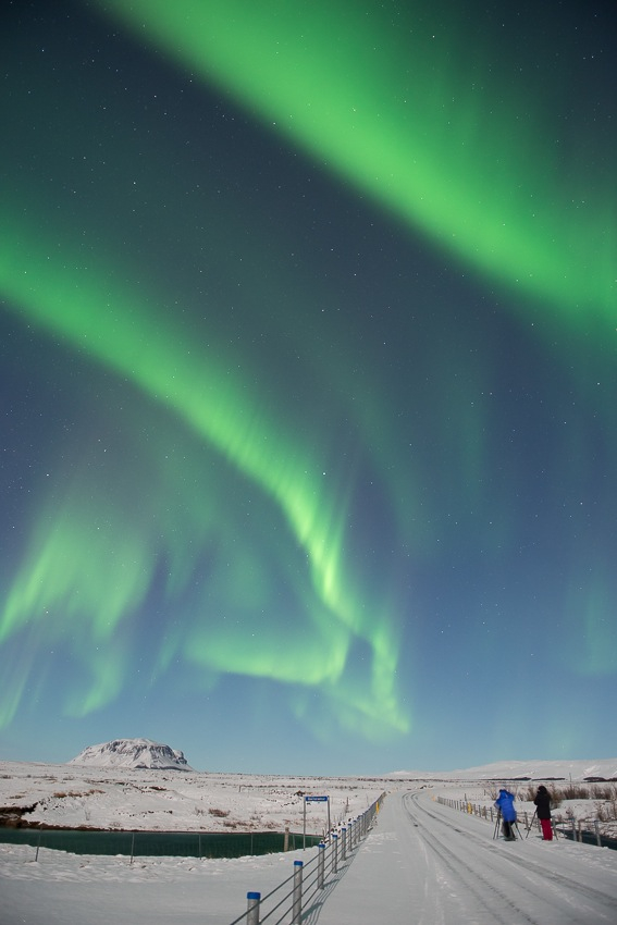
This situation is easy to correct. We move the slider (I use Adobe Lightroom, I’m sure other applications have something similar) for purple/green about 60 units, and we end up with this image.
So, what does this all mean? Well, if you add a lot of blue to the scene, it can feel cooler or colder, while adding yellow makes the scene warmer. Adding too much purple often looks like a mistake, while adding more green or yellow generally makes the image more liked.
If you want to take this further, you can use a tool like the paintbrush tool in Lightroom to paint different white balances in different parts of the scene.
Let’s take an example. Recently, I was at the Jökulsárlón Iceberg Graveyard in Iceland. It was a fairly cloudy day, but, the ice had this really amazing blue color. When I was able to transfer the photos, the photos no longer had the correct ‘blue’.
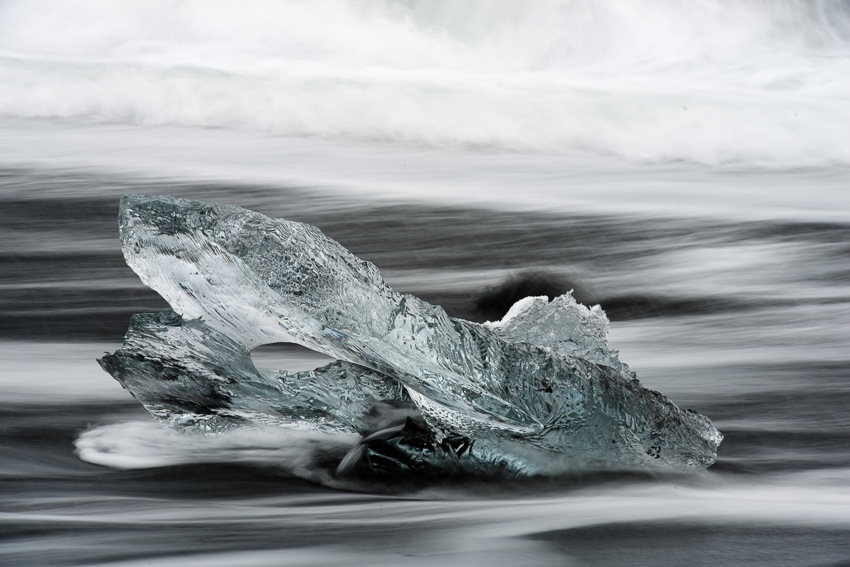
This photo has some processing performed already. The black point did not get set properly (the beach was black sand), so it was fixed for this photo. For comparison, here is the photo before I fixed the black point.
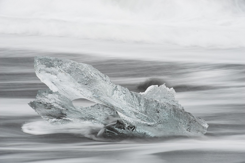
Setting your black and white points is more important to printing than it is for composing to a screen. But it does help to illustrate just how different the camera senses the world than our eyes do. It also helps to illustrate part of the trend called Shoot to the Right, or STTR, which is probably a good topic for another day.
Back to the photo. Since the resulting image was not a good representation of 1) What I wanted, or 2) What the beach looked like, I decided to fix the issue. By taking a brush tool in Lightroom and painting in a bluer white balance on the ice, I was able to create a very blue iceberg on a black sand beach, which is what I wanted.
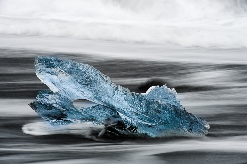
Looking back at other photos, this is likely more blue than reality. But that is ok. I chose to make it more blue to give it a cooler feeling, it is, after all, ice.
For a sunset, you may wish to selectively paint on a more yellow white balance to give that section of the image a warmer feeling.
But what happens if we give the cool/blue ice a yellower white balance?
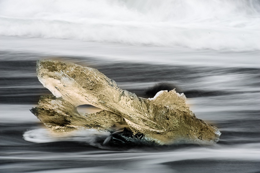
Wow, that looks terrible. I’ll leave it to the reader to decide exactly what shade of yellow that is. One thing is certain, it has lost that cool/ice feeling that the heavy blue image had.
If we adjust the temperature (blue/yellow) and tint (green/purple), we can actually change the ice to a variety of strange colors. Orange (yellow + purple), purple, green, turquoise (green + blue), etc, are all possibilities. Some of these possibilities are better than others.
Much like in #thedress, colors can change based on other items in and out of the scene. As a photographer, you can control the various elements in a scene to emphasize what you are trying to show, and balance the temperatures to support the main subject.
-M
#thedress and White Balance as an Artistic Choice